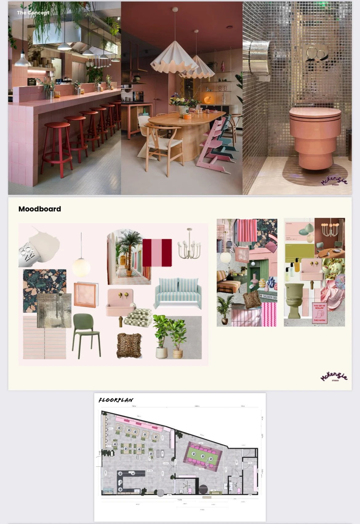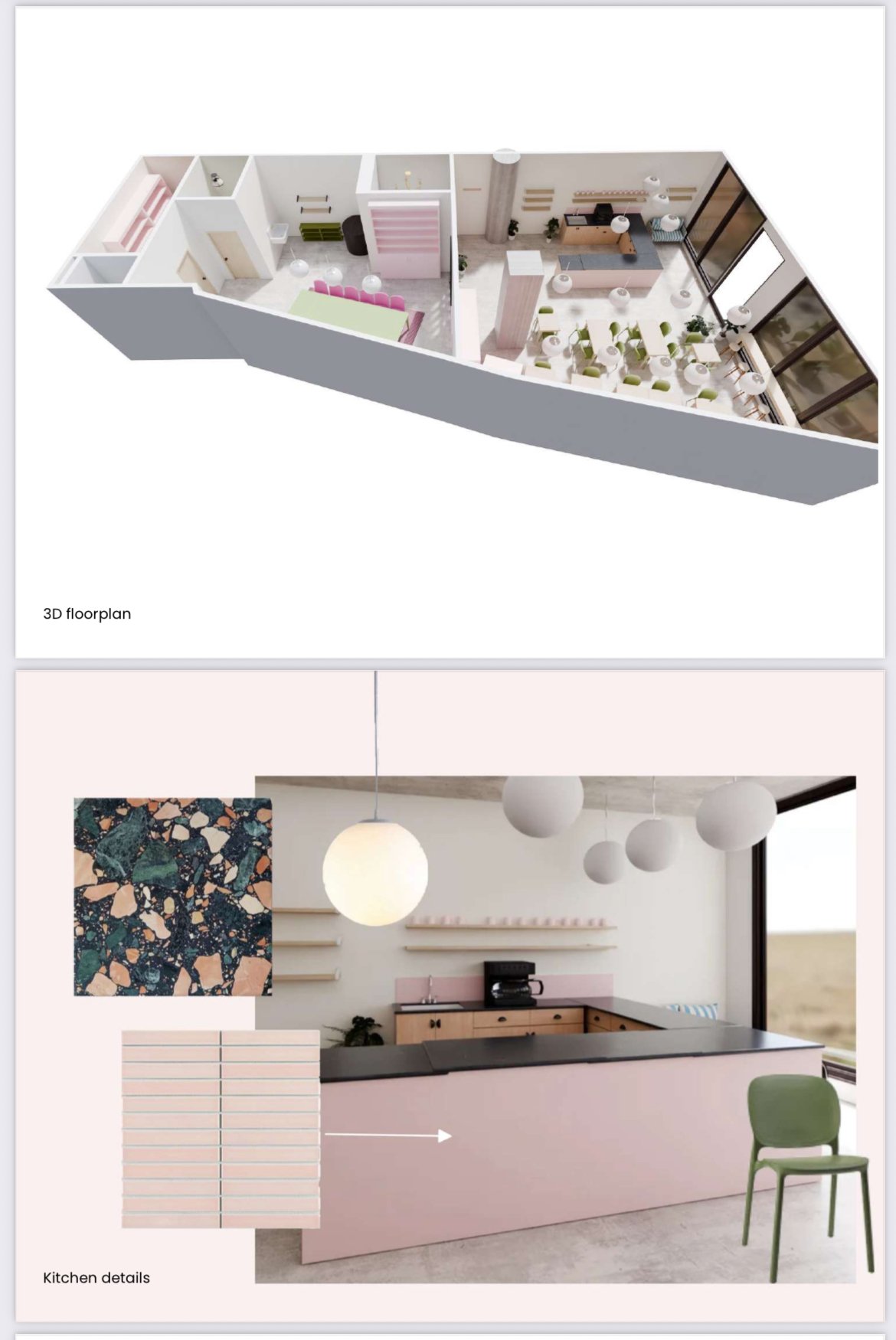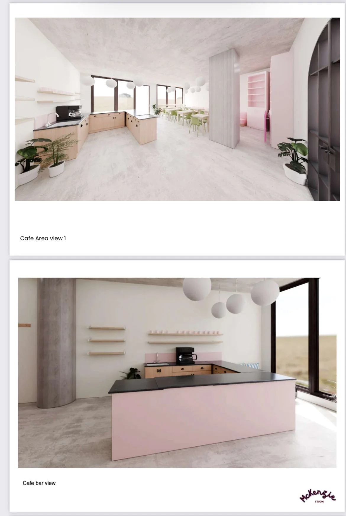
Carb Club, London Project
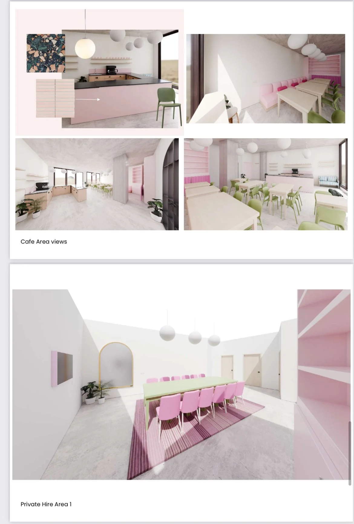
Carb Club is a bold, expressive, and joyfully curated pottery painting café designed for the Gen Z community a vibrant space where creativity flows freely, coffee culture meets pop nostalgia, and Taylor Swift or Harry Styles provide the perfect singalong soundtrack. Set within a stripped-back concrete-floored warehouse shell, the interiors embrace an industrial edge softened by playful touches and a saturated pink palette. At the heart of the café, a blush-pink tiled coffee bar becomes a sculptural centrepiece sleek, tactile, and irresistibly Instagrammable.
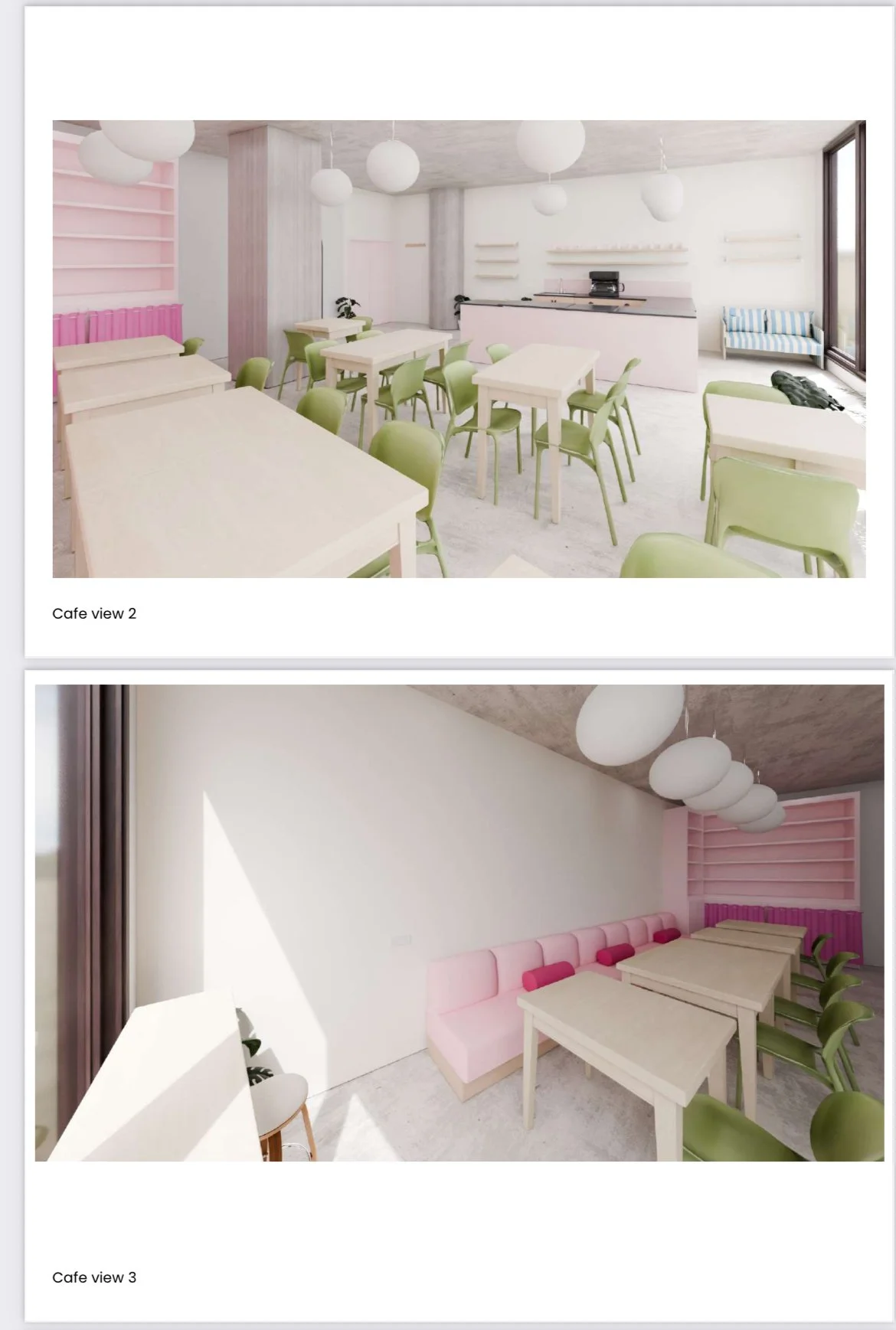
This contrast between raw materials and polished accents defines the visual identity of the space. Furniture and finishes bring together checkerboard textiles, glossy pink tiles, glass block details, and cheerful colour blocking. A striped blue and white loveseat, olive green chairs, and ruffle-edged leopard print cushions offer comfort with a twist.
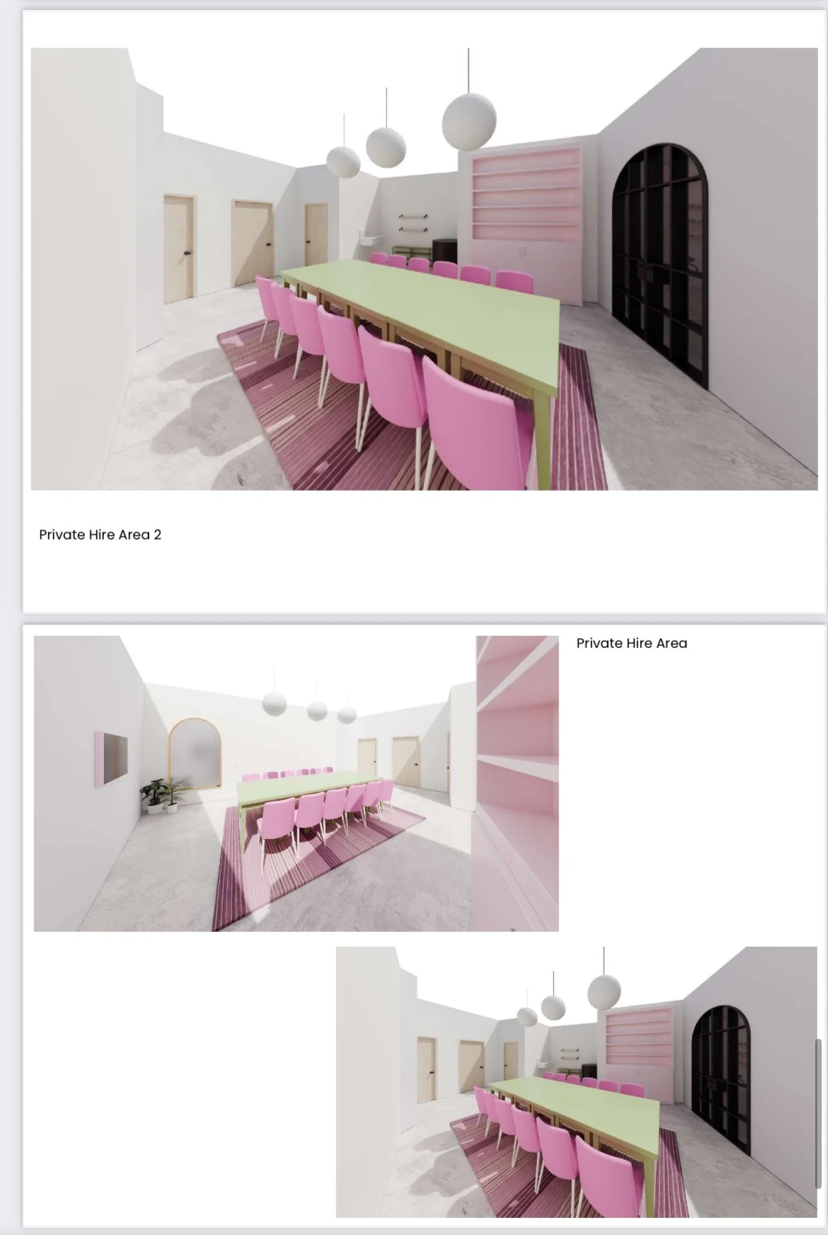
Large leafy plants punctuate the space, adding life and softness against the cool grey of the concrete floor and architectural structure. Whether guests are painting pottery, sipping lattes, or singing with friends, the layout encourages connection. A private area perfect for birthdays, workshops, or intimate moments offers flexibility within the open plan, while ambient lighting and nostalgic design details enhance the experience. Carb Club is more than a café it’s a creative playground. A place to gather, to make, to laugh, to lounge. It celebrates self-expression, carbs, colour, and community all set to the soundtrack of your favourite anthems.
Textiles Rationale
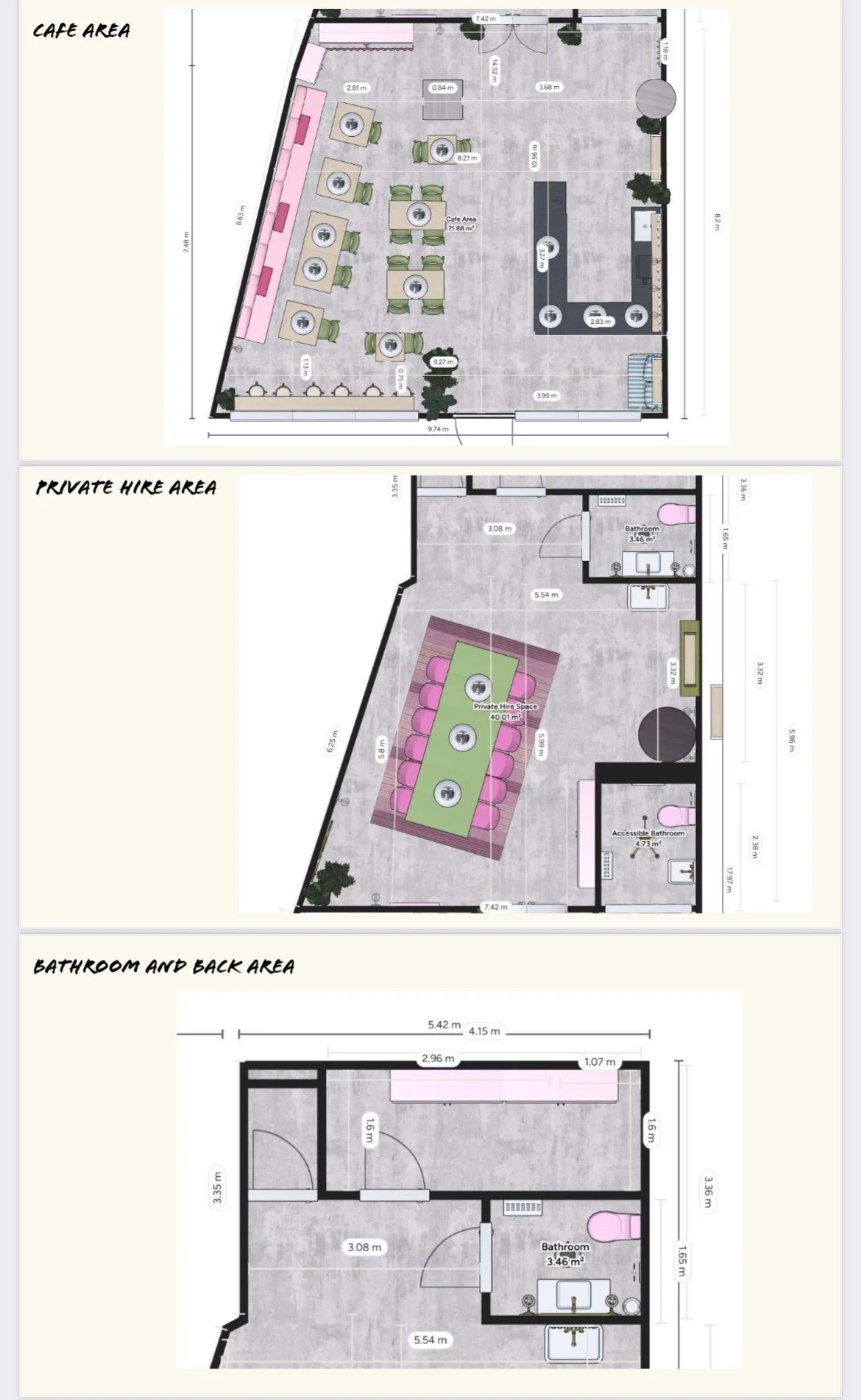
The textile choices layer tactility, pattern, and personality into the space, helping to define zones and soften acoustics within the concrete shell. Striped upholstery on banquette seating evokes classic deck chairs or vintage cafes, creating a nostalgic yet fresh look that invites relaxation and group conversation.
Checkerboard towels and linens add a graphic punch, referencing both retro motifs and contemporary digital aesthetics popular on social platforms. Leopard print ruffle cushions inject a sense of unexpected fun and Gen Z rebellion, clashing playfully with the otherwise structured colour story.
Glass blocks, while not textile, contribute to the material rhythm of transparency and soft focus, working harmoniously with sheer or matte finishes in fabrics. Material choices range from linen blends and organic cottons to velvets and bouclé-style finishes, all chosen to feel inviting, touchable, and layered. Comfort is key every surface is designed to be as enjoyable to lean against as it is to look at. Together, textiles and colour at Carb Club create a distinctive, layered environment that feels joyful, stylish, and emotionally engaging a perfect backdrop for creativity, coffee, and connection.
Colour Rationale
The colour palette celebrates contrast and charm a balance between playful pastel tones and confident saturated hues. Blush pinks, used across tiles, upholstery, and walls, form the foundational tone of the space, creating a sense of warmth, approachability, and on-brand femininity without being overly sweet. This is paired with deeper tones like raspberry red and burgundy, seen in accent fabrics and painted finishes, which provide richness and a grounding element.
Sage and olive greens introduce a nature-inspired calmness that contrasts beautifully with the concrete structure and balances the pinks in a fresh, contemporary way. These green tones connect with the potted plants and terrazzo elements, further enhancing a feeling of curated, organic modernity. Touches of natural wood and leopard print add warmth and personality, while ice blue stripes bring a nostalgic preppy reference and lightness to the material palette. The result is a confident, curated scheme that is Instagram-ready but grounded not overly saccharine, but joyfully stylish.